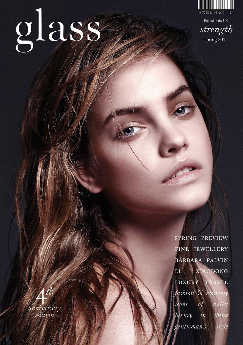

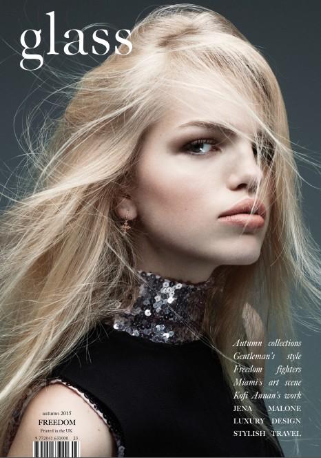


After doing a practice photoshoot, it gave me a clear idea on what kind of pictures I would like to take for my front cover. It gave me an insight on what I need to avoid as there can be some problems and challenges, for example the colour clash of the models clothing and the background. So, in order to broaden my knowledge of magazine covers in general I have done my own further research into a specific magazine called "glass" as I am really interested in how the photographer takes the pictures and what kind of clothing they use in order to compliment the background. I also like the fact that they use a continuous font for all their magazine covers, however, they do play on the colours of the fonts depending on the colour of the background to avoid any sort of colour clash. Furthermore, I am intrigued by how the photographer directed the models to pose and where to look, for example in most magazine covers directors tend to use the style of "direct mode of address" which the director for "glass" magazine has done here in the pictures above as it is a common trend and style for all their front covers.
No comments:
Post a Comment