Monday 30 November 2015

INSPIRATION FOR MAGAZINE FRONT COVER X GLASS MAGAZINE


After doing a practice photoshoot, it gave me a clear idea on what kind of pictures I would like to take for my front cover. It gave me an insight on what I need to avoid as there can be some problems and challenges, for example the colour clash of the models clothing and the background. So, in order to broaden my knowledge of magazine covers in general I have done my own further research into a specific magazine called "glass" as I am really interested in how the photographer takes the pictures and what kind of clothing they use in order to compliment the background. I also like the fact that they use a continuous font for all their magazine covers, however, they do play on the colours of the fonts depending on the colour of the background to avoid any sort of colour clash. Furthermore, I am intrigued by how the photographer directed the models to pose and where to look, for example in most magazine covers directors tend to use the style of "direct mode of address" which the director for "glass" magazine has done here in the pictures above as it is a common trend and style for all their front covers. 

Thursday 26 November 2015

PRACTICE PHOTOSHOOT


As we are now at the stage of starting our photoshoot for our music magazine, as a class we went out to Brick Lane to do a practice session on how we may take our photos by experimenting with different camera angles, a range of backgrounds, e.g: graffiti walls or just an ordinary plain background. We chose to go to Brick Lane because it is known for it's vibrant art and fashion student area, with many exhibition space. This was a bonus for me as I am basing my music magazine cover on the indie pop genre, and because Brick Lane is full of bright colours it gave me a sense of the indie theme. As indie in general is known for it's bright and crazy colours. 

By doing this photoshoot session it gave me a clearer idea on what my front cover for the music magazine will look like. For example, if I use an image where the background is a graffitied wall I will have to think very thoroughly whether it fits my colour scheme or not as I would not like it to clash. As my colour scheme is black, grey, dark maroon and lilac I would not be able to use a bright yellow background as there will be too much of a colour clash and will look very messy and unprofessional. 

By experimenting with the models and backgrounds it gave me ideas on what to change and what to make even better when doing the actual photoshoot for the magazine. For example, if my model is wearing dark colours I will place them in front of a colourful background in order for them to stand out. However, during this photoshoot session it helped me understand some of the barriers and challenges I had faced. For example, due to the fact that I did not have any props it limited on what the models can do. Also, there was no lighting which would of had a massive impact on the image as it would have created the sense of mystery; which is what the whole indie genre is all about. Therefore, when doing the photoshoot for the magazine I will use lighting and experiment with it so see the end result. will. When doing the photoshoot for my music magazine I will experiment more with different camera angles as during this session I had only used one close up. Another aspect that I will improve is to persuade the model(s) to come out of their comfort zone to get a range of end results of my photos.

Friday 13 November 2015

MASTHEAD PREFERENCES


As part of my research, I asked students around the sixth form which font do they prefer as a masthead. Although some students chose either the second or third option my research showed that majority ticked the fifth choice and based on its popularity I made the decision to use it as my final one for my music magazine masthead. 

Wednesday 11 November 2015

MASTHEAD IDEAS


I have designed 6 possible ideas for my masthead as it will broaden my ideas on how I may want it to look like on my music magazine. By using a pencil, it allowed me to experiment with different sizes of fonts and any extra designs that I wanted to add. Adding to that, when looking more into masthead ideas I can look online to search for different types of fonts and see if my ideas and the searched ones will merge together and get a final idea for the magazine. 

Tuesday 10 November 2015

NME MASTHEAD


General background:
'NME' is a British music magazine that is typically associated with rock, alternative and indie music. Seeing as I am basing my music magazine on an indie pop genre, 'NME' was the perfect magazine to look into as I can get an insight on what their magazine consists of. 

'NME' are usually into the likes of Lana Del Ray, FUN, Lily Allen, The xx and many more. These artists mainly focus on the indie pop side of music which is why 'NME' may include news on them and their music career. Their magazines consist of music news, reviews, interviews with artists and they also sponsor a tour of the United Kingdom by up-and-coming bands each year. In the 1960's bands like The Beatles and Rolling Stones were frequently featured on the front cover. As well as these two popular bands, there were also other artists that appeared at the NME Poll Winners' Concert, which is an award event that featured artists voted as most popular by the audience. 


Masthead: 
As I am currently looking into different types of mastheads on magazines, 'NME's title and logo stood out to me more compared to the others. The use of the big and bold font is very eye catching, as well the boldness of it the colour red is very bright and intense which can easily grab the audiences attention from when they are in a store browsing for magazines. This will give me some ideas on how my masthead for my music magazine should look like as I will be aware of how big or bold the font should be and what I should base my colour scheme on. 

Monday 9 November 2015

MUSIC MAGAZINES MASTHEADS


The masthead on music magazines and even magazines in general have the same characteristics; they are big, bold, colourful, although some are black and white. Adding to that, most magazine mastheads are in capital letters as the magazine editors may want to attract more and more audiences. As the audience, when we browse around for magazines we first notice the price to see if it will be affordable and beneficial to buy, moreover, the masthead of a magazine and main image are the most important aspects of a magazine too, and they also determine whether we would want to buy the magazines or not.

Sunday 8 November 2015

WHY DO PEOPLE READ MAGAZINES?

"Magazines will always have a place on people's shelves."


Magazines are a really great source of information and entertainment. People who read magazines on a regular daily basis tend to be the most informed about the world; depending on what types of magazines they read. Women tend to read magazines more frequently than men and they enjoy reading magazines that are associated with fashion, beauty, health, celebrity gossip and home-care magazines. On the other hand, men have their own favourite topics, such as; sports, technology and business.

While newspapers contain simple and straightforward news, magazines tend to consist of selected stories, going a step further in enlightening the reader. Most newspapers contain information for a general audience whereas we have magazines that focus on specific aspects of life such as health, fashion, business etc. 


Many people just read magazines for pleasure as they enjoy reading into the topics they like as they can buy the magazine that they prefer to read. Compared to newspapers, magazines have lots of colour and pictures which grabs the readers attention as they can read as well as looking at the images that relate to that topic. 
In some cases, people who are so invested in celebrities lives tend to read magazines to be informed about their personal lives and the latest gossip about them. For example, they like to know what events they attended, who they are dating, latest fashion trends and so on. 


INDIE POP MUSIC MAGAZINE; MOODBOARD


As my genre for my music magazine is Indie Pop, I have created a mood board which just consists of indie pop music magazines. Often, we see artists that regularly appear on an indie pop music magazine like Lana Del Rey, Lorde and bands like Arctic Monkeys, Florence and the Machine and Bastille. By looking at the mood board and seeing the images that I have researched we see that an indie pop magazine tends to use dark colours such as; black and red. They then use lighter colours like turquoise and pink to contrast with the darker texts or images. I think this works really well as they compliment one another and the end results show that it is a success to it's audience. 

Saturday 7 November 2015

MAGAZINE CONVENTION ANALYSIS

R&B Music Magazine

Audience of R&B Music Magazines
The general target audience for R&B music magazines are teenagers and young adults (ages 16-25) both male and female so people who listen to R&B music listen to radio and TV stations such as MTV BASE, Radio1 Extra, and Kiss etc. Due to the fact that they play a lot of R&B music it attracts their audience even more which makes them more intrigued about the artist/band which is why they may buy the magazines about them and get an insight on their personal lives. Moreover, by looking at the artists fashion sense and the way their body language is, you get a sense of what people they aim their music at as teenagers and young adults represent themselves in a similar way with the fashion sense.

Layout Fonts/Typography and colour schemes
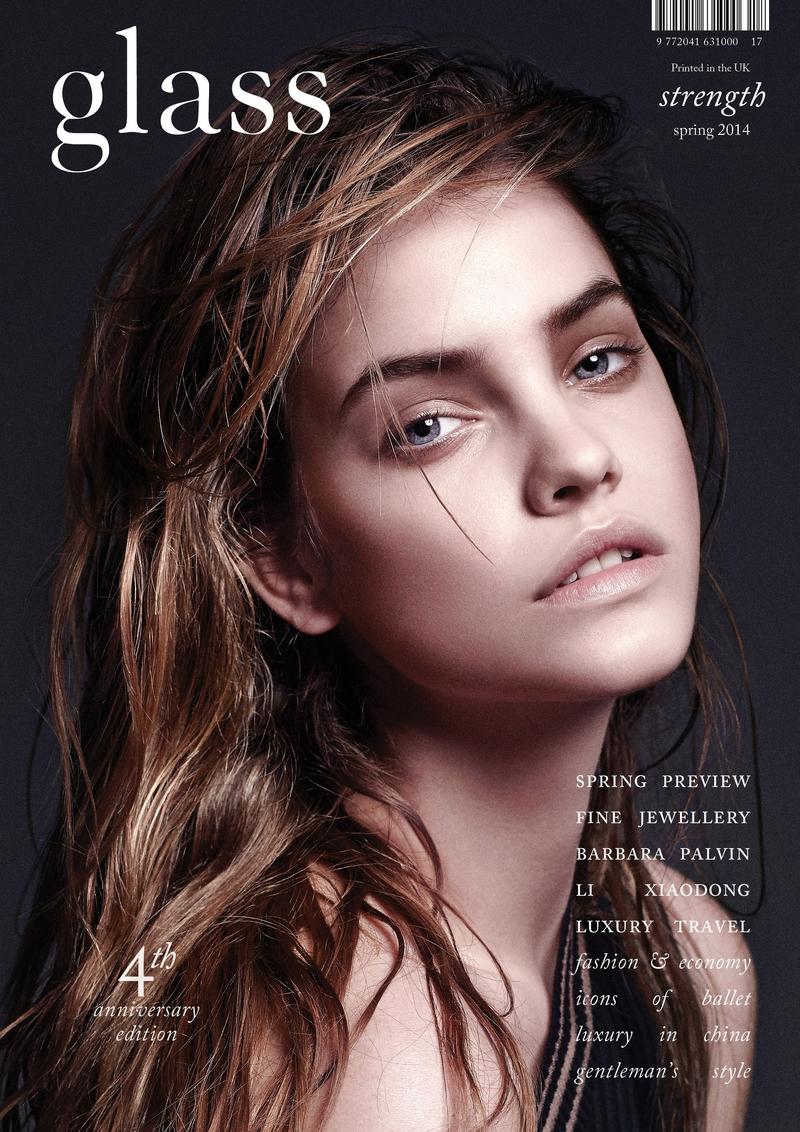
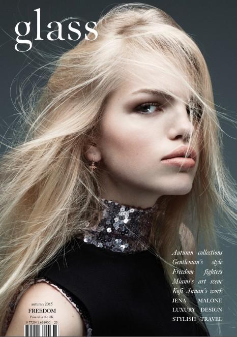
The 'Billboard' magazine always have a white bold masthead which sometimes contrats with the main image, where the artist may wear dark types of clothing. 'Billboard' magazine have a variety types of fonts as it all depends on the main image most of the time. The colour that is mostly used on R&B music magazines are a range of dark colours, such as black and red and even bright colours where they use white, yellow, orange and pink to contrast one another and not clash together. This is similar to the Indie Pop Music genre as they use a vast majority of colours on their magazines to compliment the darker colours.

Types of articles/content
R&B music magazines consist of contents such as interviews with artists, first look at photos from music videos, show reviews, record breaking charts, new music from artists and upcoming tour dates from international artists like Rihanna, Drake, Rita Ora, Usher, Nicki Minaj and many more. 

Main focus
The main focus for an R&B music magazine is what artist is taking the world by storm and breaking records as they are considered the 'biggest R&B artists' if they do so. R&B music magazines also give us an insight on the artists as we get to know them even more through interviews, which is another main focus. 

Pop Music Magazine
Audience of Pop Music Magazines
The target audience for Pop music magazines are typically younger females aged 12-16 as these magazine companies would target these particular audiences by fulfilling their expectations. For this particular type of genre, the demographics is shown in the magazine by using aspects like bright colours, popular artists of the time such as boy bands as they have a massive amount of fan girls, filling their gender demographic.

Layout Fonts/Typography and colour schemes
The masthead of a Pop music magazine always stands out as it is typically bright and bold which attracts the target audience. The masthead should always have a relation to music. For example, 'We Love Pop' is a good and clear example as it involves the word 'Pop' which is a well known genre of music. The fonts are always very eye catchy and chatty to it's audience which attracts their attention them even more. Colour scheme wise, they will use bright and vibrant colours to make it stand out from the other magazines in order to attract their audience. Throughout the magazine, they will use the same colour scheme so the magazine as a whole has a constant style. 


Types of articles/content 
Pop music magazines consist of fashion trends and celebrities throughout the magazine. It also includes stories and gossip about a range of artists and band and an a3 sized poster(s) of a popular artist at that time. To capture the attentions of young teenagers the magazines include quizzes and competitions so they can play a part and win prizes or even tickets to see their favourite artist at concerts. In a humorous sense, pop magazines pick the funniest celebrity pictures and associates them with a witty caption. For the audience to get involved they send embarrassing stories about themselves and the magazine also pick the most popular and must watch films, TV programmes and games.

Main focus
The main focus on Pop music magazines are the artists themselves, their music, events such as the BBC Radio 1 event and upcoming festivals.

Indie Pop Music Magazine

Audience of Indie Pop Music Magazines 
Like every other types of music magazines, Indie Pop also has its specific audience. For example, 'NME' is a music magazine which is devoted to the Indie Pop genre. They are also very clear on who their audience is as they state that it has an 'intensely engaged audience consisting of 16-24 year olds.'

Layout
Often, celebrities that are featured on the 'NME' magazine are presented as edgy and daring by wearing odd, different and unusual attires. 
The layout for an Indie Pop music magazine are very specific and clear cut, they tend to have a clean design and layout which allows us as the audience to focus more on the central image of the band or artist, therefore, it makes the image clearer in the readers mind. 

Fonts/Typography and colour schemes
The fonts that are featured on Indie Pop music magazines are often big and bold, while there are also main colours, such as; red, white and black. It is clear to see the style of Indie Pop on the covers as we mostly see dark colours which sometimes contrast with the lighter colours. On some occasions the magazine cover may also consist of bright and vivid colours such as yellow and pink, to fit with this edgy style. Adding to that, these colours are generally associated with the indie genre as a whole. They also typically consist of graphic and bold features but to a lesser extent.

Types of articles/content 
Generally, indie pop music magazines consist of music reports, interviews with a range of artists, undiscovered artists and fashion trends. It also consists of artists upcoming tour dates/events such as; The Neighbourhood, Lana Del Ray, and The xx and many more. 

Main focus
Similar to the rock genre, there is more focus on the artists themselves rather than celebrity gossip, this is because readers are more interested in the artist and their music life, instead of general gossip and rumours about them.

Wednesday 4 November 2015

WHAT IS INDIE POP MUSIC?

    What is Indie Pop Music?
    Indie Pop music is a genre or sub-genre of alternative music or alternative rock and is also short for the name "independent music." The word 'indie' was used to describe artists on independent labels. 
    What instruments are used? 
    Indie Pop music includes male and/or female vocalists, nylon guitars, electric guitars, acoustic and electric drums, melodic and non-melodic percussion, synth bass, pianos and keys and many other additional instruments that provide todays target audience with the music they listen to such as; Pop, Indie and alternative sound. 
    What makes Indie Pop genre different than the other genres? 
    Indie Pop is very different from other genres as they have different sounds and instruments used. The melodic angst-free, less noisy sound makes the music sound calm and soothing. The instruments that are used like; the guitar, bass and drums are not used in todays music, seeing as though most music have a techno style. This makes Indie Pop music much more valuable and precious compared to all the other genres that are out there in todays society.