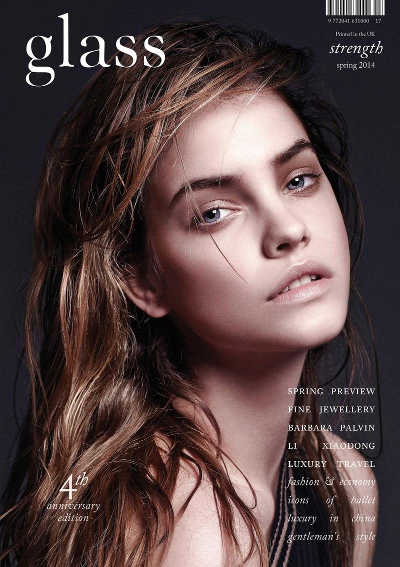
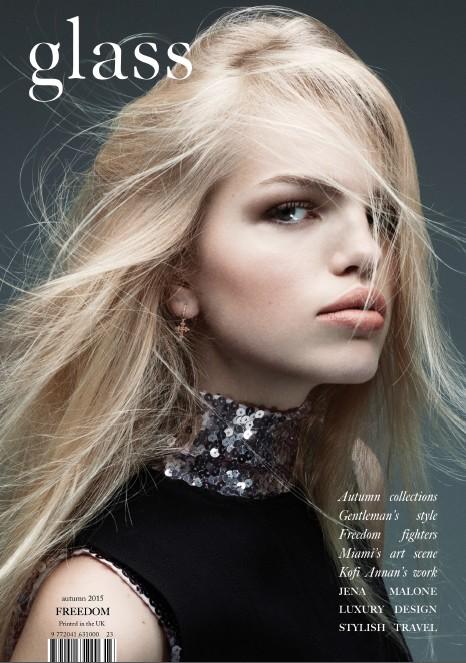
After doing a practice photoshoot, it gave me a clear idea on what kind of pictures I would like to take for my front cover. It gave me an insight on what I need to avoid as there can be some problems and challenges, for example the colour clash of the models clothing and the background. So, in order to broaden my knowledge of magazine covers in general I have done my own further research into a specific magazine called "glass" as I am really interested in how the photographer takes the pictures and what kind of clothing they use in order to compliment the background. I also like the fact that they use a continuous font for all their magazine covers, however, they do play on the colours of the fonts depending on the colour of the background to avoid any sort of colour clash. Furthermore, I am intrigued by how the photographer directed the models to pose and where to look, for example in most magazine covers directors tend to use the style of "direct mode of address" which the director for "glass" magazine has done here in the pictures above as it is a common trend and style for all their front covers.
 As we are now at the stage of starting our photoshoot for our music magazine, as a class we went out to Brick Lane to do a practice session on how we may take our photos by experimenting with different camera angles, a range of backgrounds, e.g: graffiti walls or just an ordinary plain background. We chose to go to Brick Lane because it is known for it's vibrant art and fashion student area, with many exhibition space. This was a bonus for me as I am basing my music magazine cover on the indie pop genre, and because Brick Lane is full of bright colours it gave me a sense of the indie theme. As indie in general is known for it's bright and crazy colours.
By doing this photoshoot session it gave me a clearer idea on what my front cover for the music magazine will look like. For example, if I use an image where the background is a graffitied wall I will have to think very thoroughly whether it fits my colour scheme or not as I would not like it to clash. As my colour scheme is black, grey, dark maroon and lilac I would not be able to use a bright yellow background as there will be too much of a colour clash and will look very messy and unprofessional.
By experimenting with the models and backgrounds it gave me ideas on what to change and what to make even better when doing the actual photoshoot for the magazine. For example, if my model is wearing dark colours I will place them in front of a colourful background in order for them to stand out. However, during this photoshoot session it helped me understand some of the barriers and challenges I had faced. For example, due to the fact that I did not have any props it limited on what the models can do. Also, there was no lighting which would of had a massive impact on the image as it would have created the sense of mystery; which is what the whole indie genre is all about. Therefore, when doing the photoshoot for the magazine I will use lighting and experiment with it so see the end result. will. When doing the photoshoot for my music magazine I will experiment more with different camera angles as during this session I had only used one close up. Another aspect that I will improve is to persuade the model(s) to come out of their comfort zone to get a range of end results of my photos.
 As part of my research, I asked students around the sixth form which font do they prefer as a masthead. Although some students chose either the second or third option my research showed that majority ticked the fifth choice and based on its popularity I made the decision to use it as my final one for my music magazine masthead.