(School Magazine- Front Cover)
MAGAZINE COVER
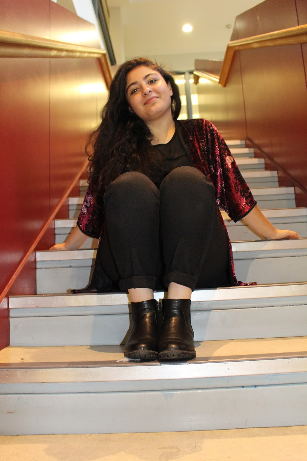
EVALUATION
To create my school
magazine cover, I used the software Adobe Photoshop CC 2015. For my masthead, I
have titled it “Sixth Form Weekly” and used a dark green bold font so that it
stands out compared to the other texts on the front cover. I have used
the dark green for the masthead because it contrasts with the colour of the
headscarf on the model. I also made it bold so that it can stand out as well as
the main image which is the most vital aspect. One aspect that I
would improve is to use the same font for the sell lines so that it does not
clash together. On my front cover, I used 4 different colours, which are black, white, orange and red that matched
the colours on the models blazer so that it does not mismatch. I also used a
shape tool to create a rectangular shape behind the masthead in order for it to
stand out. I used this tool because as I was experimenting with the
masthead I realised that it did not stand out as much as I wanted it to due to
the glass door behind the model which would have been better on a plain
background. Adding to that, I would improve the angle of the picture, as it
would be much preferred as a mid-close up.
(School Magazine- Contents Page)
CONTENTS PAGE
EVALUATION
When creating my
contents page for the school magazine I kept the same font as my front cover
which was Impact as I wanted it to be a continuous style, rather than
having a completely different font which will look unprofessional. The pictures
that I have used are very clear but to improve I will position the pictures
straight rather than titled in the main task magazine. Another thing that I
would improve would be the background, as I would choose a lighter colour as
dark colours can be harsh (unless I create my music magazine based on the genre
rock then dark colours would be preferred). So, when making my final magazine, I will experiment more with how the background will contrast with the
texts. However, I did
continue using white for the main font colour, as I liked how it contrasted with the
black box behind it as it is aesthetically pleasing to the audience. The bold title for the
“CONTENTS” is the main attraction as people read magazines in ‘Z formation’ so
as it is in the top left hand corner it becomes easier for people to know that
it is the contents page. With the informative text, it is quick and snappy
which means that the audience will be captivated and are more likely to read.
Otherwise, it would be too wordy and they would easily be disinterested.