
Wednesday, 23 December 2015
Tuesday, 15 December 2015
MAKING OF: SELL LINES


At first, my sell lines were all on one side but when completing it, they all clashed because of the colour and the way they were set out. There was also an empty space on the left side which looked
While arranging the sell lines, I realised that the white clashed with the background and I decided to change it to black so it compliments the colour blue.
This is the rearrangement of my sell lines and I decided to place a few sell lines on the left side, as it was previously empty. I also changed the shade of blue and decided to do royal blue so that it does not blend in with the models jacket and instead contrasts it.
MAKING OF: SELL LINES


I created a small, long box with the rectangle tool and placed it under each sell lines so it looks aligned and as the colour of the box is black, it made the sell lines stand out even more and look organised.

Friday, 11 December 2015
MAKING OF SELL LINES


Monday, 7 December 2015
PHOTOSHOOT


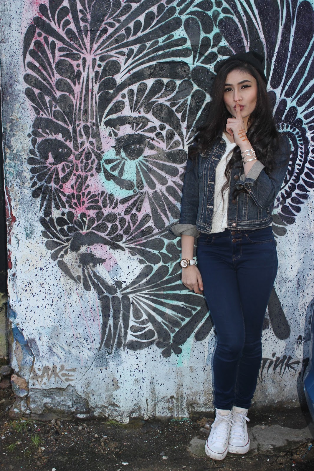
For my photoshoot for the music magazine cover, I have taken over 300 pictures and it was really difficult to choose my favourite ones. However, I have chosen my top 10 pictures that I think was successful during my photoshoot. What went well during the photoshoot was that the clothes that my model(s) were wearing complimented the background and made their outfit stand out really well. As well as taking photos indoors, I also went outdoors and this broadened my ideas as there were loads of different coloured walls and even graffiti walls that can be used as a background.
Wednesday, 2 December 2015
PREPARATION FOR PHOTOSHOOT


In preparation for my photoshoot, I have chosen a selection of outfits for my model that will best fit the indie fashion criteria. Typically, the indie fashion consists of dark colours but to make it more vibrant it also consists of bright colours so that there is a balance between dark and bright colours. But, when choosing what colours to use, the most popular colours are the lighter tones like, red, blue, pink and yellow etc.
For my photoshoot I decided to go full on with the makeup on my model as I wanted to go big and bold on the eyes and the lips. I decided to do so as the indie fashion criteria usually are composed with very daring make up products which are very vivid and eye catching.
Therefore, I mostly chose dark colours like black and dark grey jeans; but also a mix of brighter colours such as the red shirt so that they can contrast one another and as well as any of the backgrounds of the places and locations that I will be taking my photos in.
I will also be using the Canon EOS 600D camera to take my photos.

Subscribe to:
Comments (Atom)